Bank refinance after the SVB panic
Reading bank balance sheet data

In this respite from the rush of bank failures, let’s take a moment to understand the financial shifts that took place over the last month. Today, three key visualizations of the SVB panic so far, using balance sheet data from the US commercial banks and from the Fed.
I must ask for your forgiveness—I got a bit lost in the data these last few days, so this piece has ended up being something of a data dump. I will aim for more synthesis next time!
Balance sheet flows
The first graph is based on the Fed’s H.8 release, the weekly aggregate balance sheet of US commercial banks. I show each balance sheet entry as a flow, an increase or decrease relative to the previous week. Bars pointing outward, up in the top panel or down in the bottom panel, indicate an expansion; bars pointing inward indicate a contraction.
I have smoothed the flows using a rolling average (e.g. (Deposits_t - Deposits_(t-4))/4). This has the advantage that it hides flows which are quickly reversed; it has the disadvantage that big flows are not immediately reflected.
Here is the result:

First observation: the SVB panic has had a big effect on the balance sheet of the US banking system. The most recent data points show a step change from anything else that banks had been doing over the past year. From around the beginning of 2023 until March, banks had been losing deposits (purple bars in the lower panel). This contraction was mostly matched by falling reserves (“cash assets,” yellow bars in the upper panel).
Just before SVB failed, banks had been busy selling securities (orange bars in the upper panel). It was not the first time in recent months, but notable in light of the importance of unrealized losses on banks’ securities portfolios.
During the recent stress, banks have gone to the discount window and to the bank term funding program (red bars in the lower panel), which has led to increased reserves (“cash assets,” yellow).
Broken out by size
Helpfully for the current situation, the H.8 also breaks the data into large (top 25 by assets) and small banks (all others). This graph is presented using the same structure as above, but with large banks to the left and small banks to the right:

The key difference is that the banking system’s net deposit outflows are coming from the small banks. Large banks are gaining deposits, though not enough to make up for what the small banks are losing.
Fed’s balance sheet
We can see the emergency lending also on the Fed’s balance sheet, where it appears as an asset. Using the same format as above, this graph shows flows in balance sheet quantities on the US central bank’s balance sheet. (Note that these figures are more current by one week than the bank data.) On the asset side, the lending appears here as “Other assets.” On the liability side, reserves have been expanding:
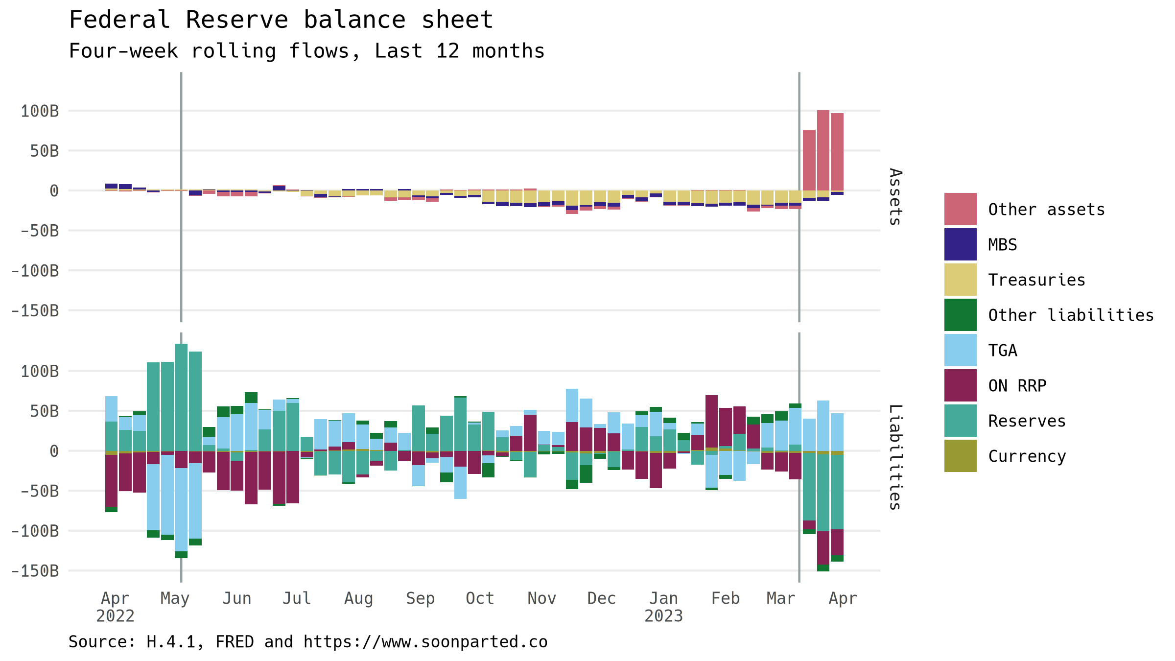
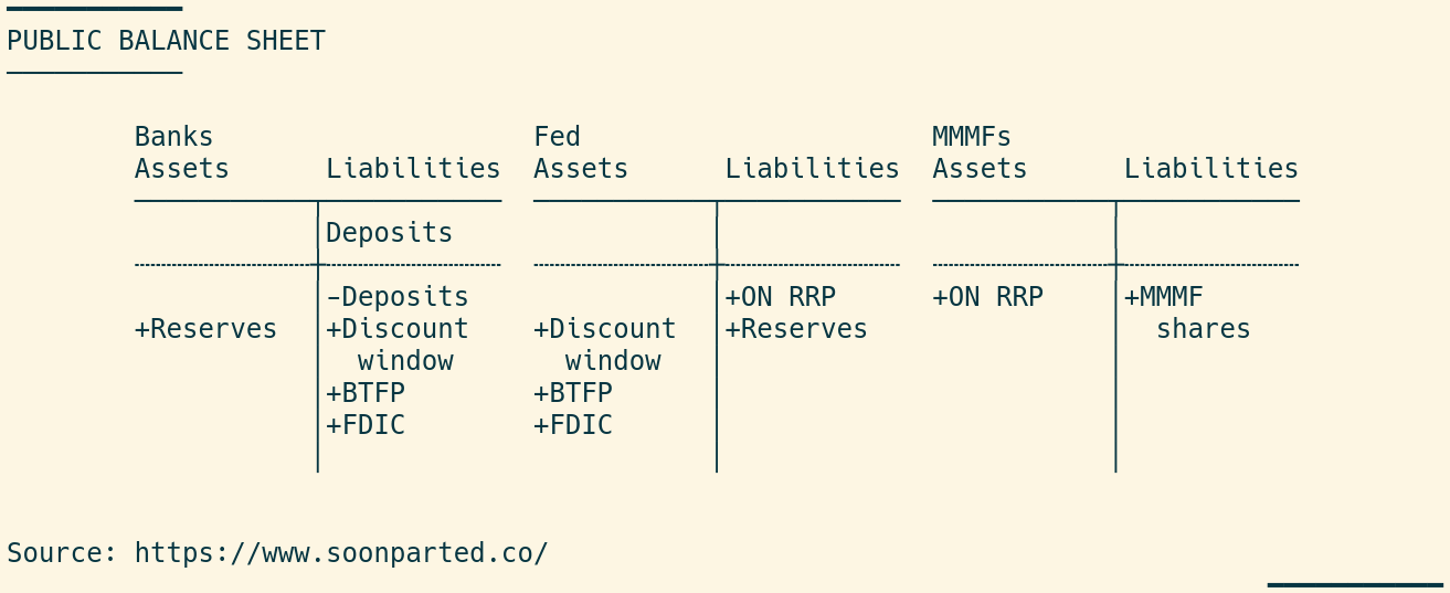
Not only reserves, though. The Fed’s overnight repo deposit facility has also seen increased usage. This helps get closer to a balance-sheet representation of the whole situation. Banks have lost deposits; these have been more than replaced by new borrowing from the Fed over three main channels (discount window, BTFP and via the FDIC), so expanding banks’ reserves. Deposits leaving banks have migrated to money market funds, which have placed it in the ON RRP deposit facility:
Two caveats
I am thinking of this as an ongoing situation, and so the analysis remains a work in progress. At least two big wildcards remain. The first is the Treasury General Account, the US government’s deposit account at the Fed, which has seen considerable outflows over this period. I would tentatively attribute this to the Treasury’s maneuvering ahead of reaching the debt ceiling.
The other is that by smoothing out the flows to show systemic effects, I am hiding some back-and-forth in the weekly data. I am comfortable drawing conclusions from the four-week flows, but timescales do tend to shrink during a crisis.
More to come.